

BRANDING
YOU FEEL
BRAND IDENTITY & STRATEGY
We create brands people connect with, support, and proudly represent, by blending bold design, strategy, and storytelling to make an impact.
PROJECT: ATLANTA CITY FC BRAND BUILD
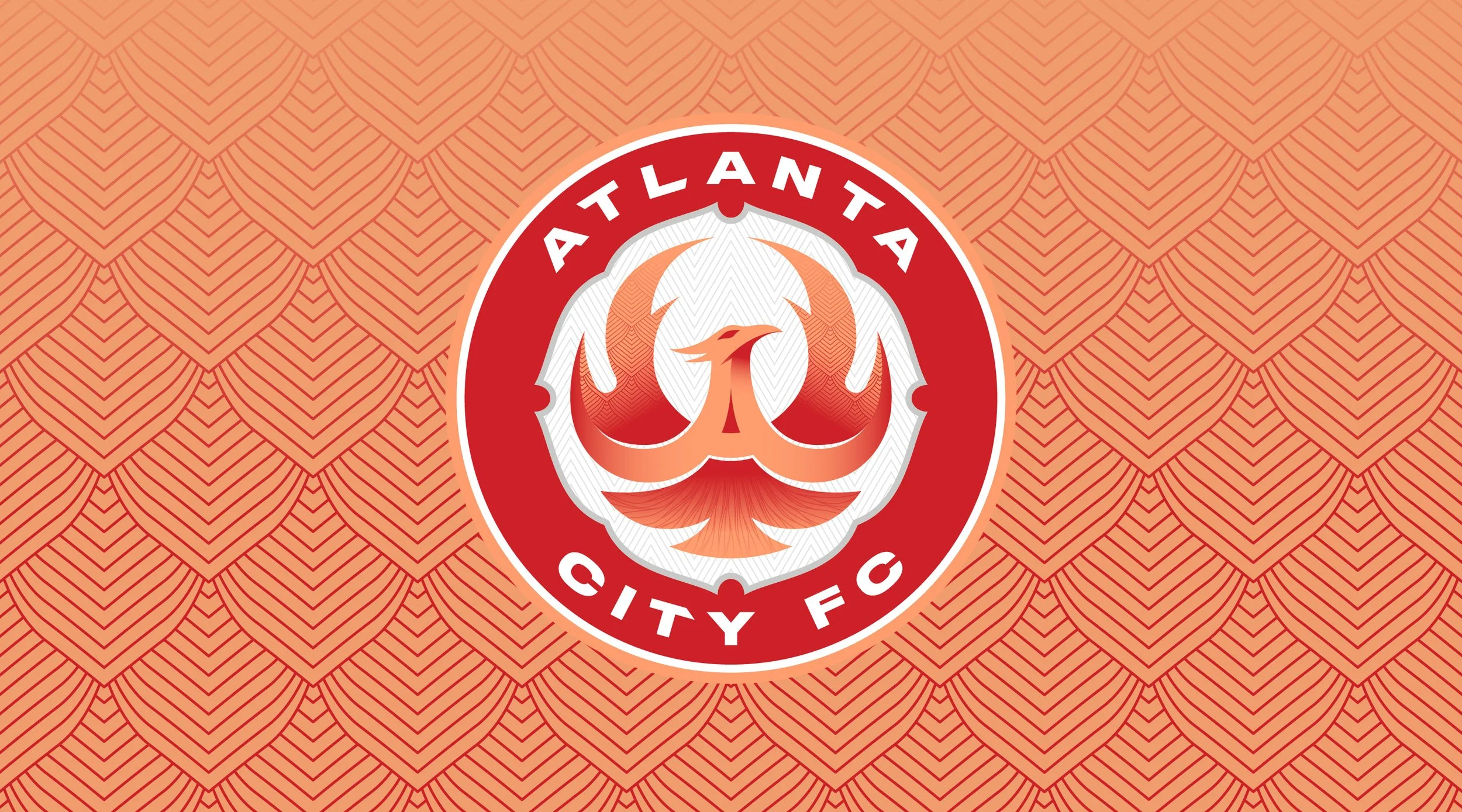
Fueling the Identity
The Brand Foundation
Inspiration Boards

The Phoenix
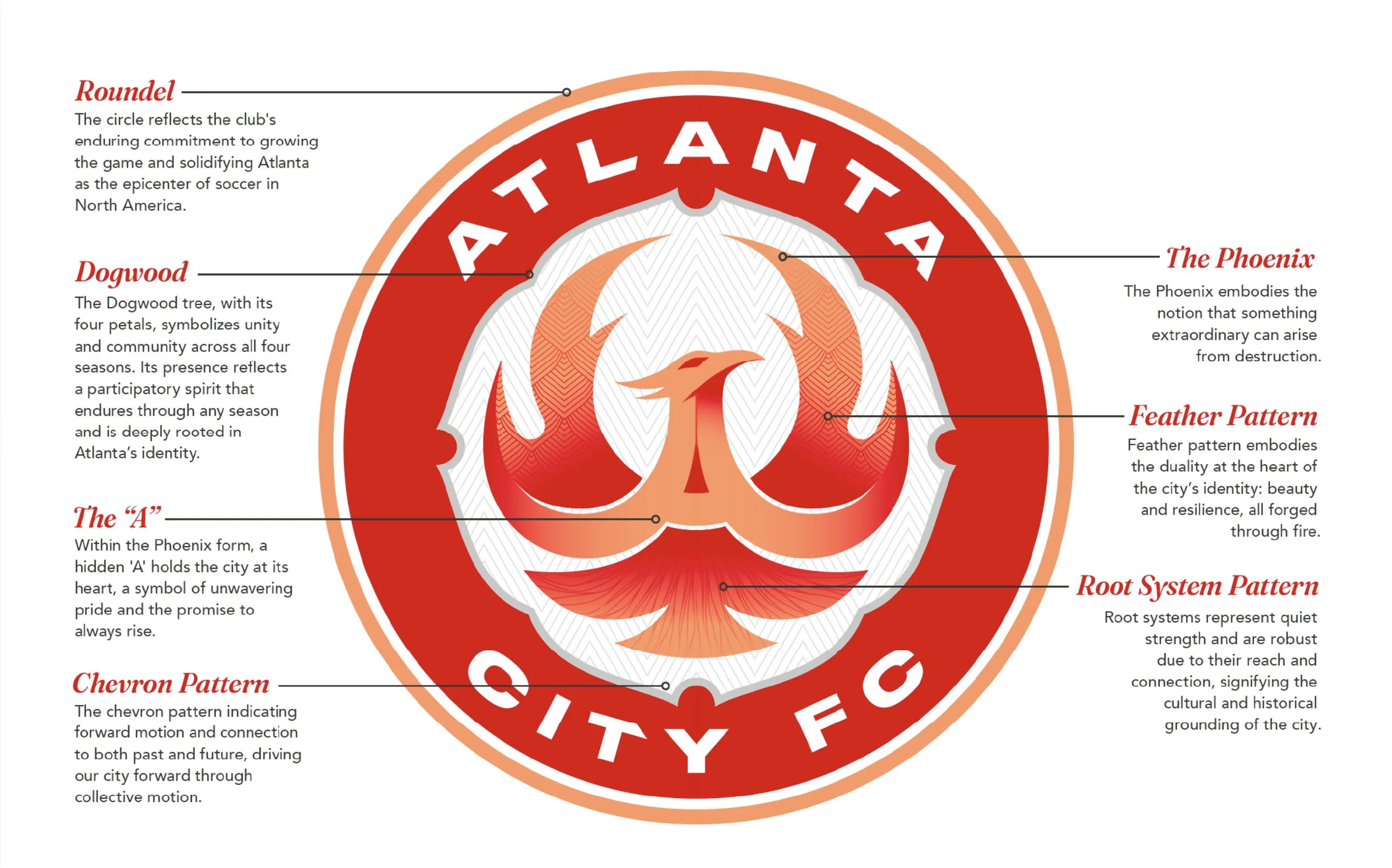
The Phoenix embodies the notion that something extraordinary can arise from destruction. Furthermore, it symbolizes neighborhoods, cultures, and voices that contribute to the collective strength of the city.

The Dogwood
The Dogwood blossom, with its four petals, symbolizes unity and community across all four seasons. Its presence reflects a participatory spirit that endures through any season and is deeply rooted in Atlanta’s identity.
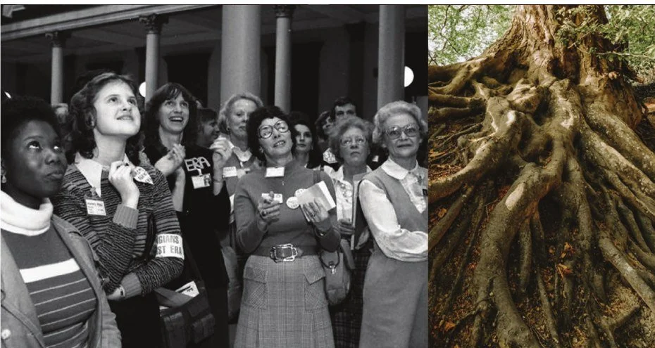
Rooted in History
Root systems represent quiet strength and a connection to place. They are robust due to their reach and connection, signifying the cultural and historical grounding of the city.
Fueling the Identity
Club Manifesto
Atlanta doesn’t wait for permission. It rises.
From railroads to runways.
From civil rights to global culture.
From neighborhoods that move to their own beat.
This is a city that turns struggle into strength.
That turns diversity into power.
That turns belief into momentum.
A crossroads of the world.
A city of languages, music, food, ideas, ambition.
All moving in the same direction.
Forward.
Coretta Scott King said women are the soul of the nation.
In Atlanta, you can feel that soul everywhere.
In the rhythm of the music.
In the courage of its history.
In the belief that tomorrow can always be bigger than today.
And the belief that the people here are the ones who shape what comes next.
Atlanta is not one story. It’s many.
We carry that spirit.
Relentless. Fearless.
Because this…
It’s the energy of a city.
The pride of its people.
It’s the soul of Atlanta.
One city.
Fueling the Identity
Club Rally Cry
The Soul of Atlanta
Atlanta City FC represents the spirit of the city itself, uniting every neighborhood, culture, and voice that gives Atlanta its rhythm.
Inclusive. Elegant. Unstoppable.
“The Soul of Atlanta” reflects a city shaped by resilience, reborn through challenge, fueled by determination, and elevated by ambition. A place where diversity is strength and belief pushes the city forward.
Building the Brand
Visual Identity
Club Colors

Atlanta Red
Fire & rebirth. Red like the phoenix rising from the ashes, reflecting a city that burns bright with resilience, passion, and the relentless spirit to rise stronger every time.
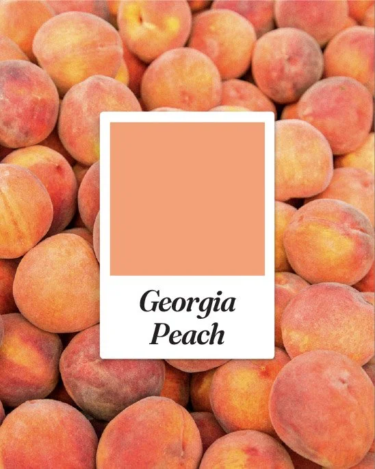
Georgia Peach
Rooted in the same clay that defines Georgia, peach stands as a state icon symbolizing the unity, warmth, and shared pride of the communities that shape who we are.
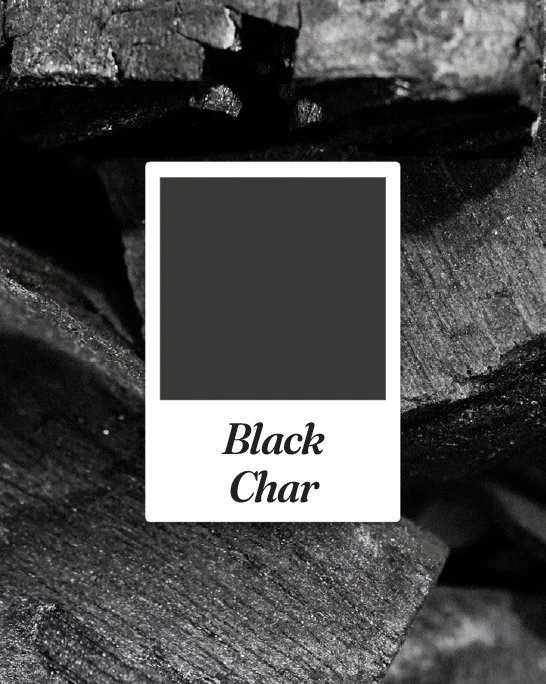
Black Char
Atlanta’s identity is forged in the Resurgens spirit. A place where even charred remains of the past are the very catalyst for the power and success of the future.

Platinum Metallic
Representing rarity and excellence through cultural dominance, platinum symbolizes strength and our resistance to tarnish, always shining and in pursuit of world-class achievement.
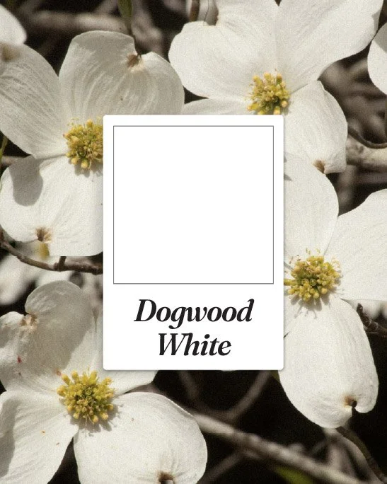
Dogwood White
Dogwood blossoms symbolize unity and community across all four seasons and are deeply rooted in Atlanta’s identity.
Club Crest & Marks
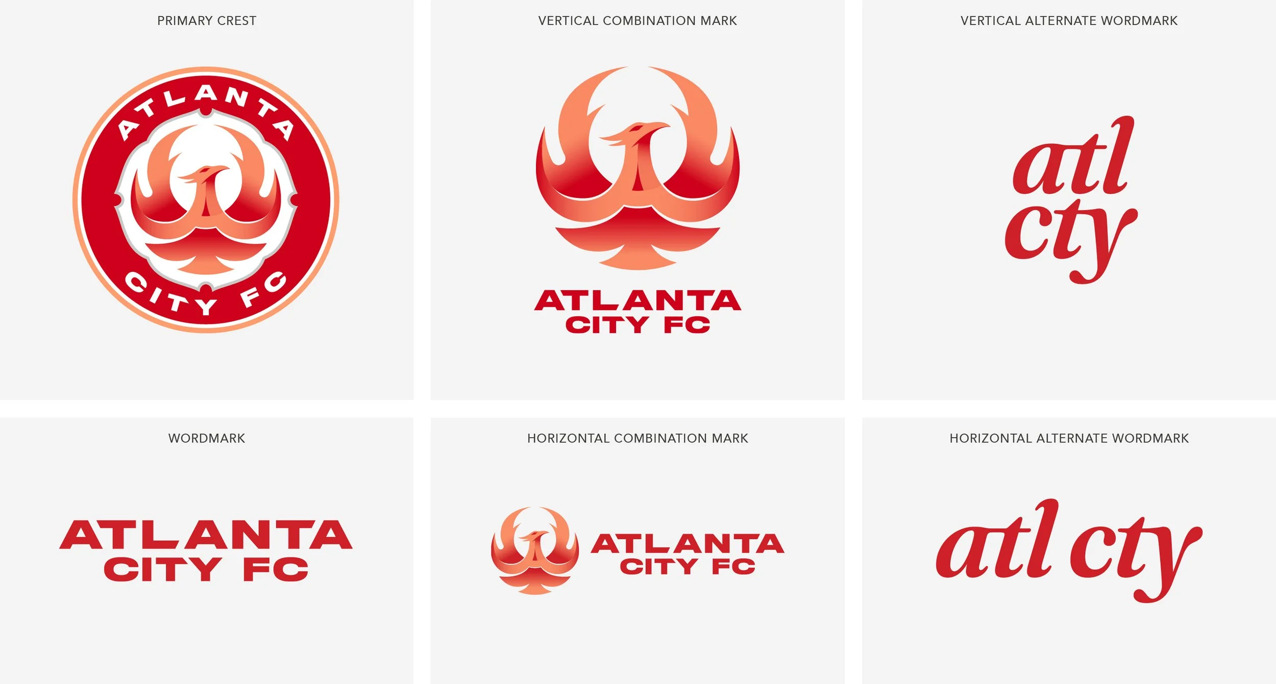
Club Crest Symbolism
Applied to Merchandise
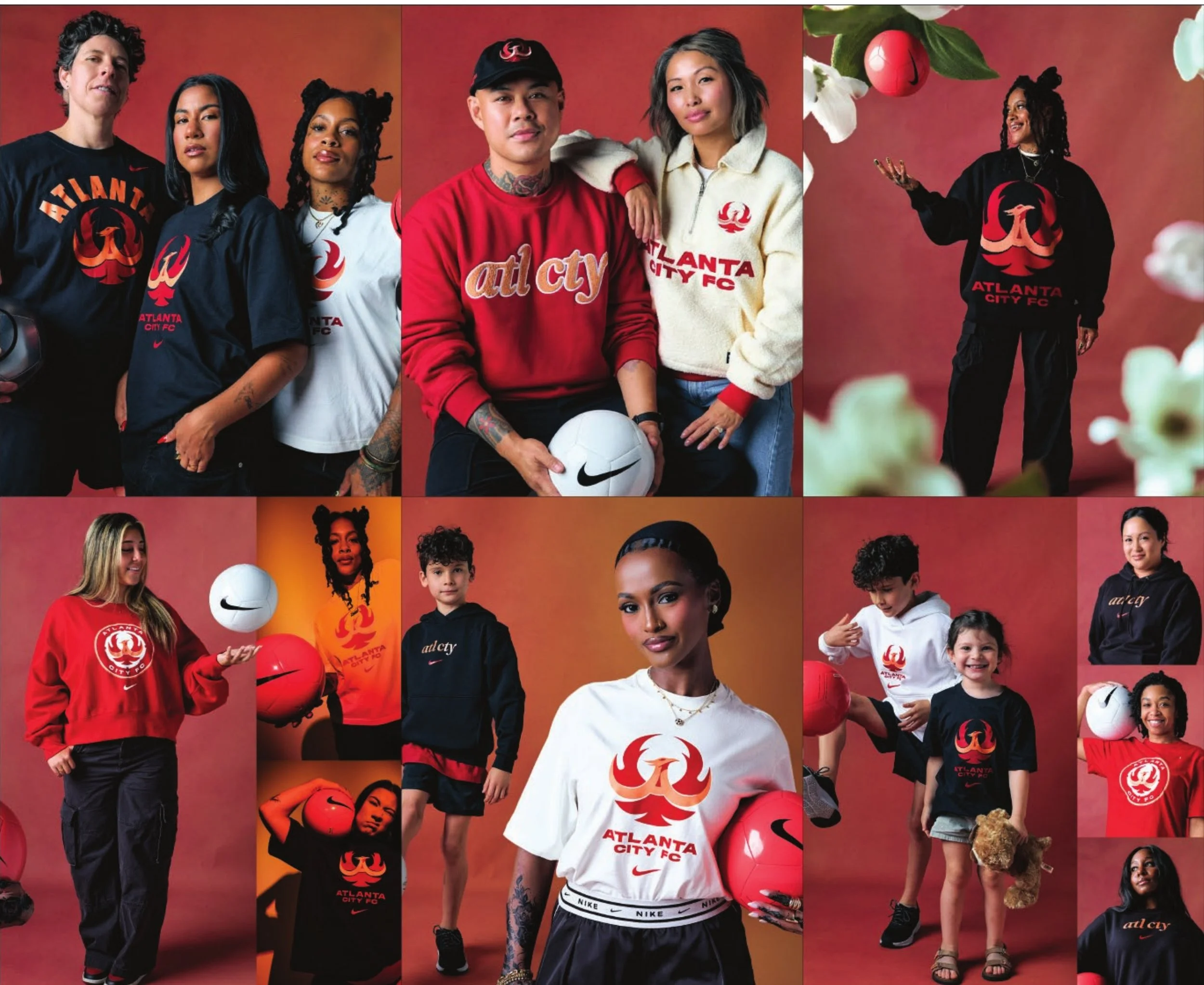
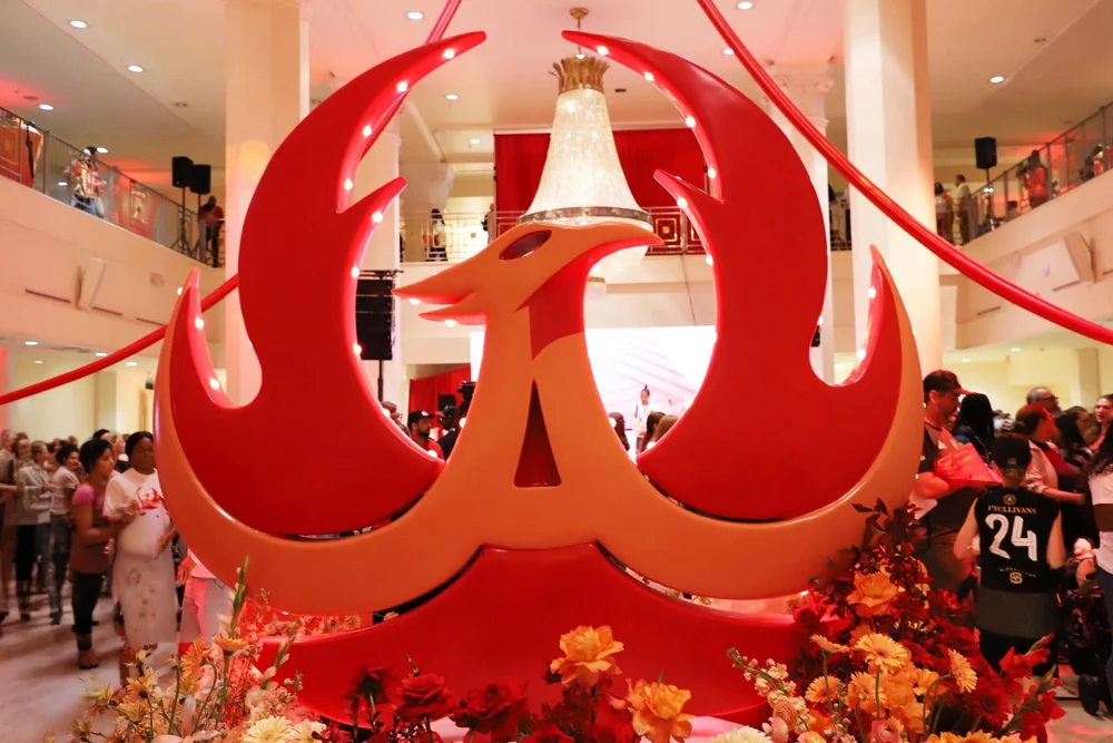
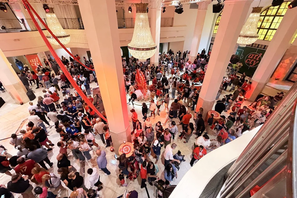
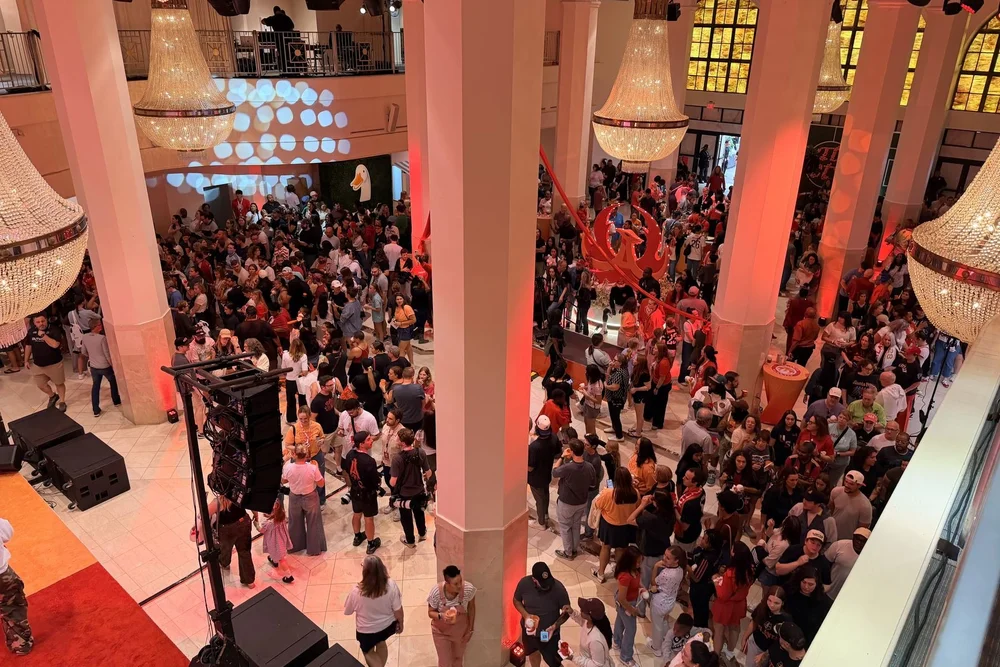
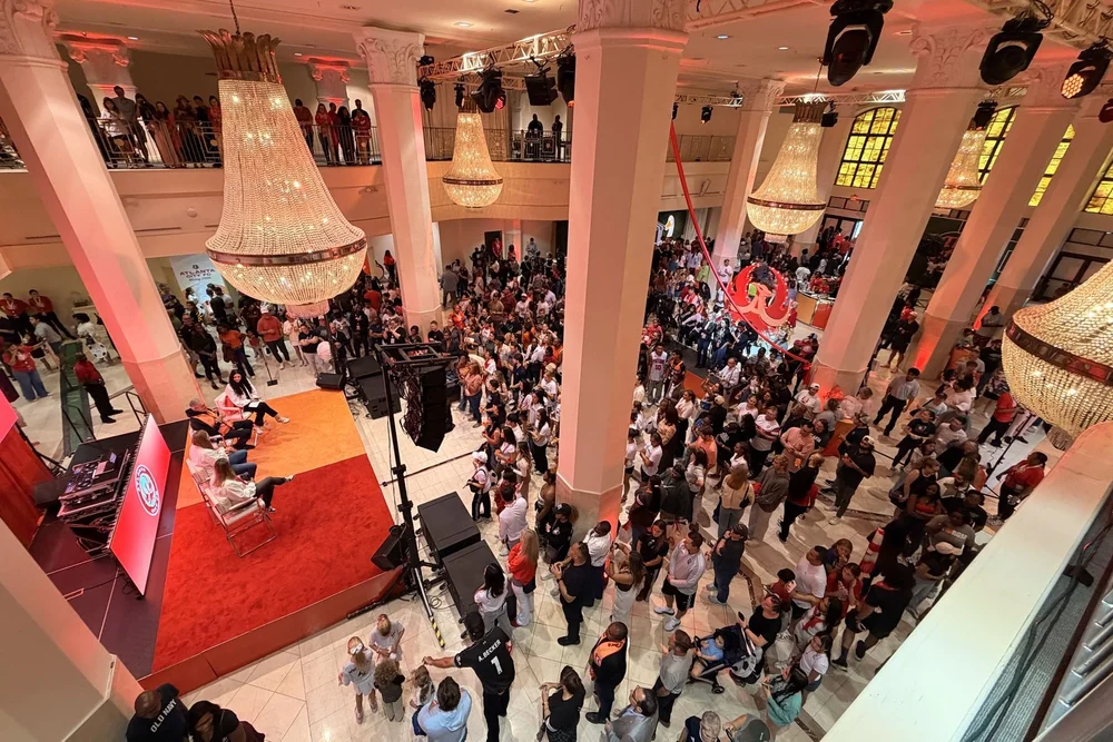
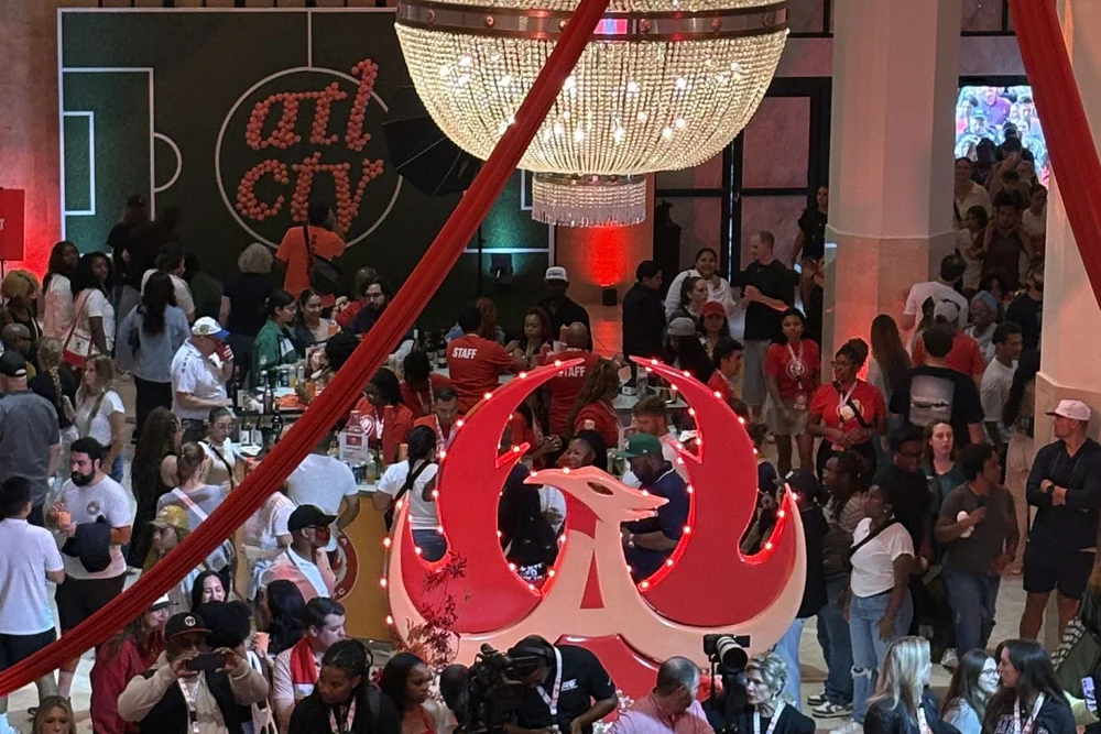
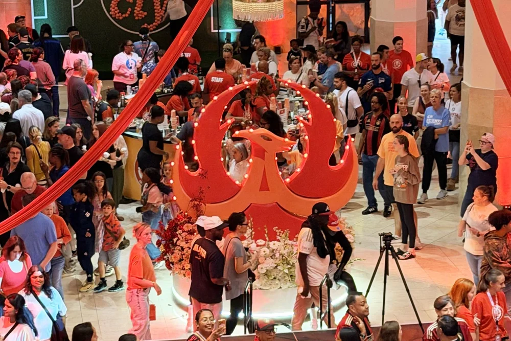
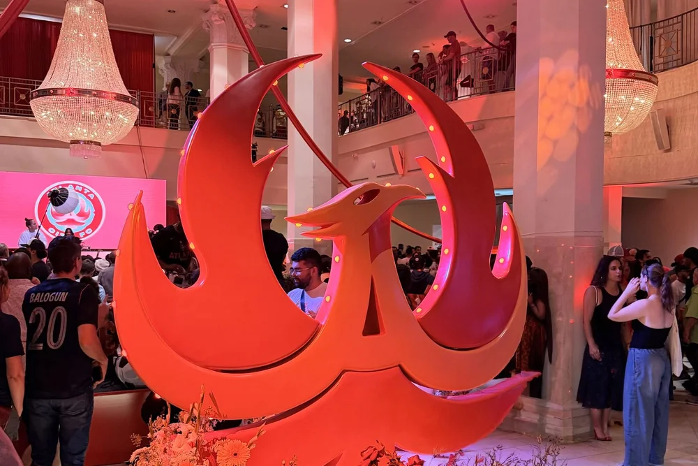
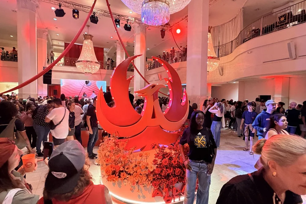
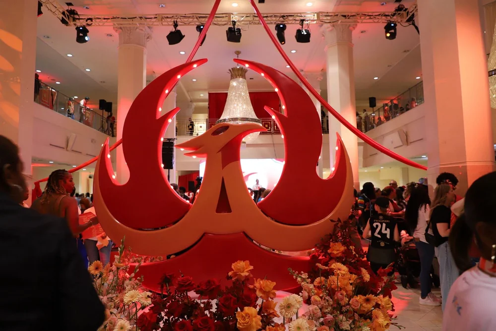
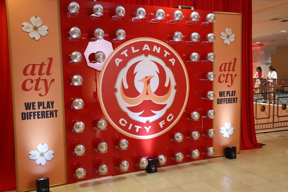
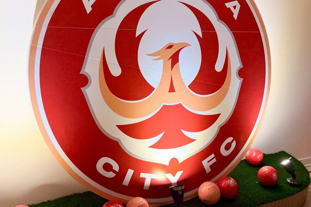
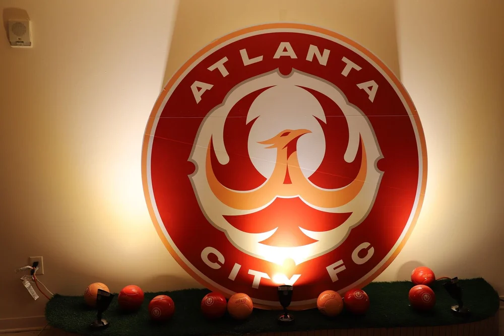
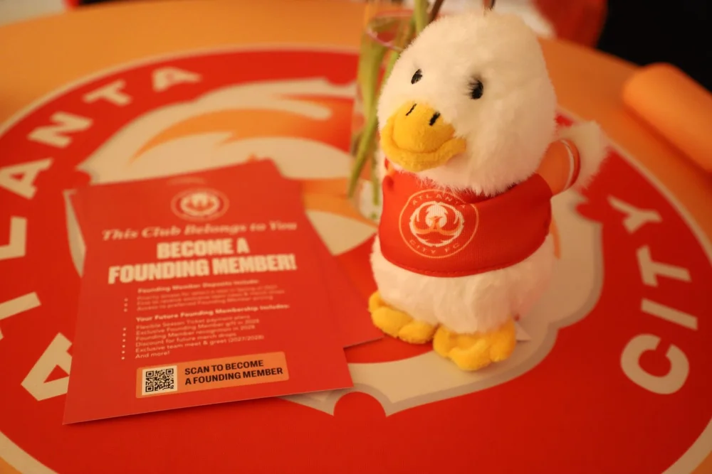
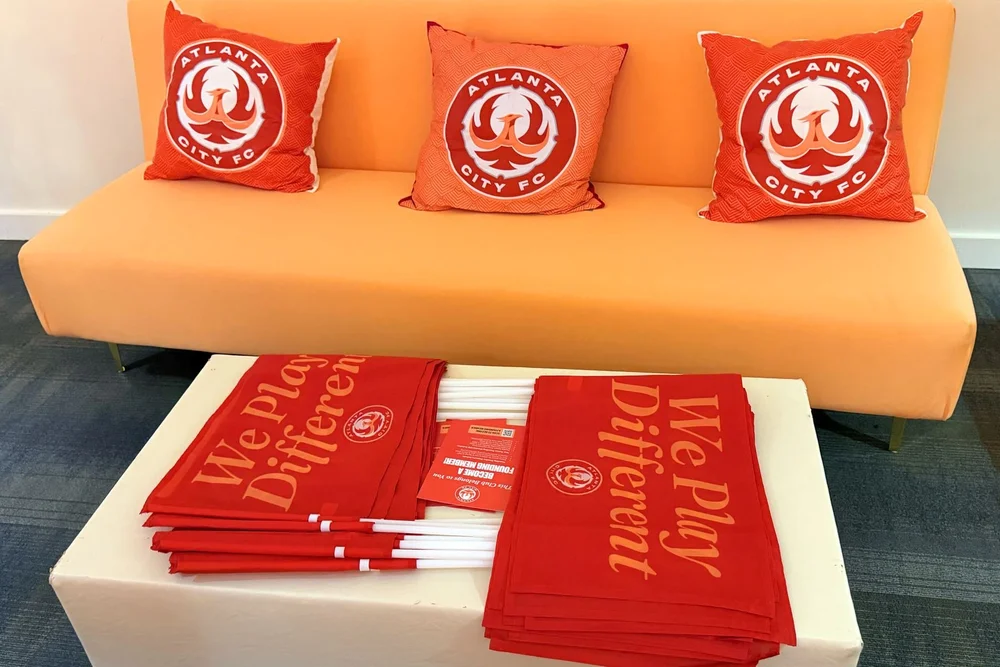
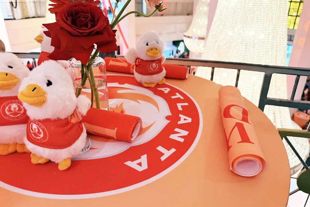
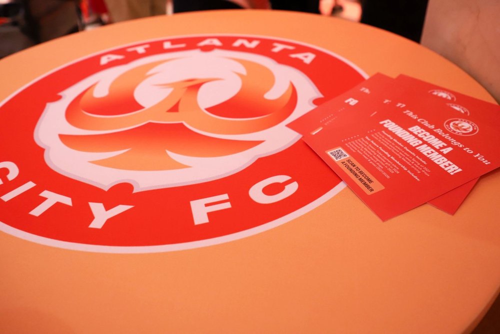
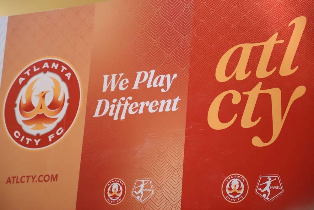
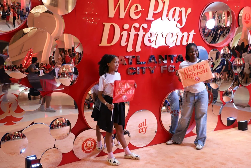
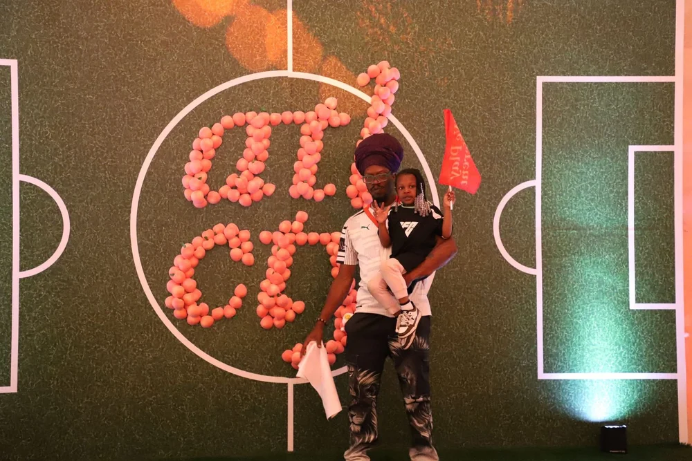
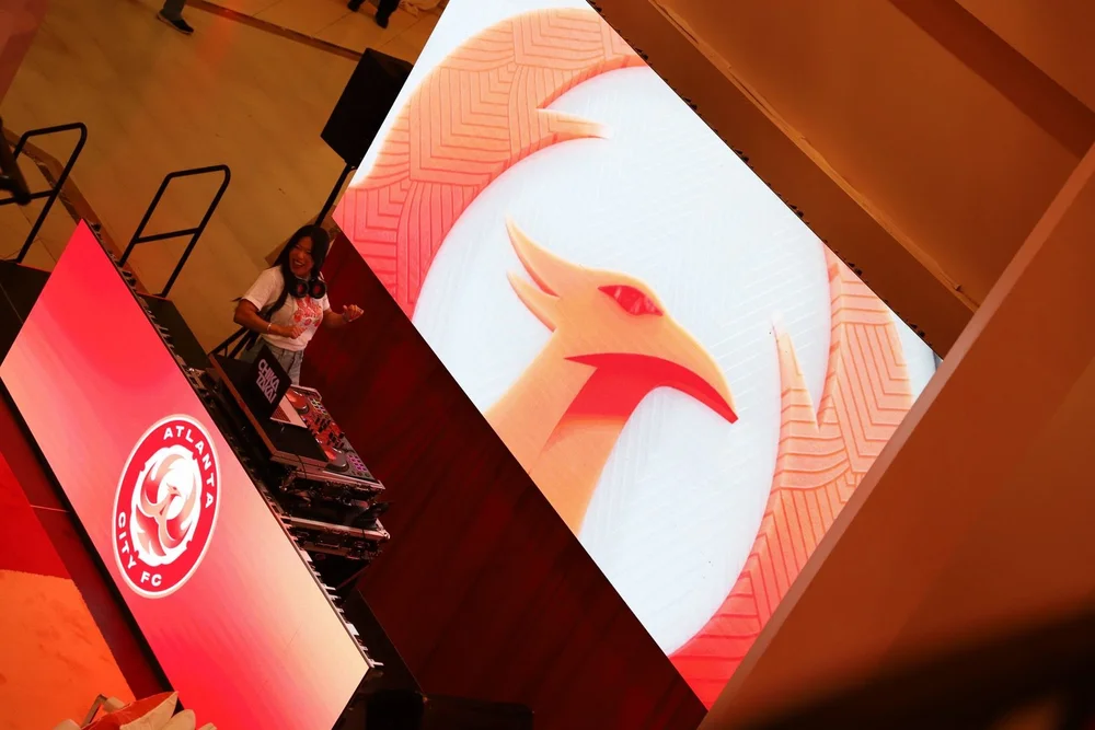
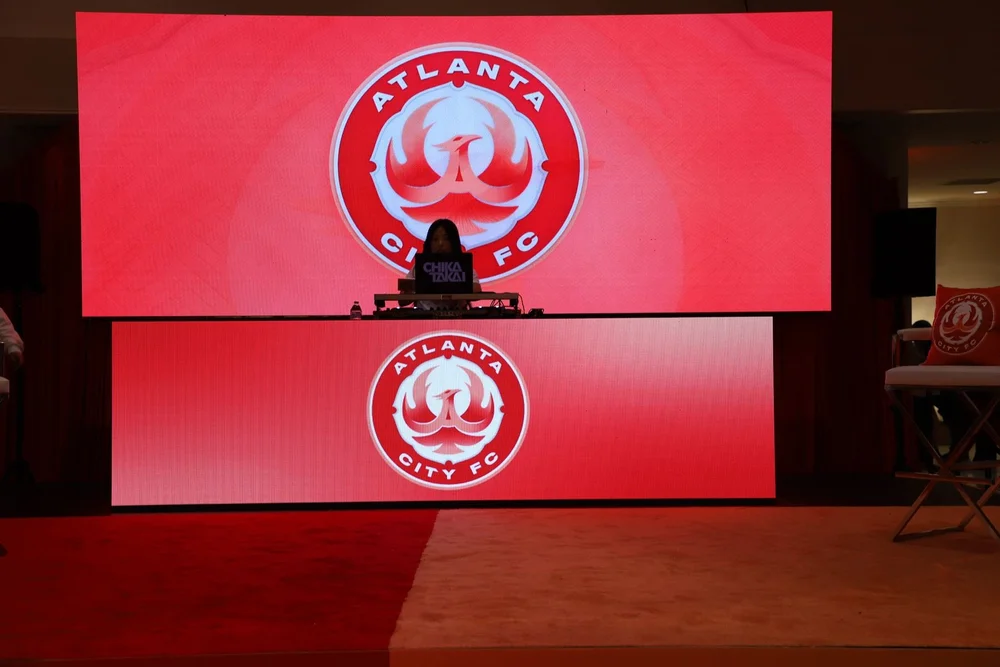
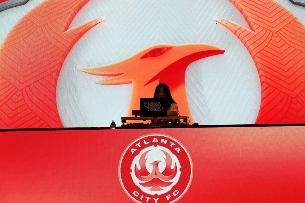
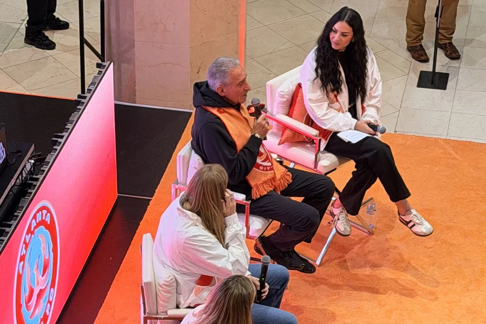
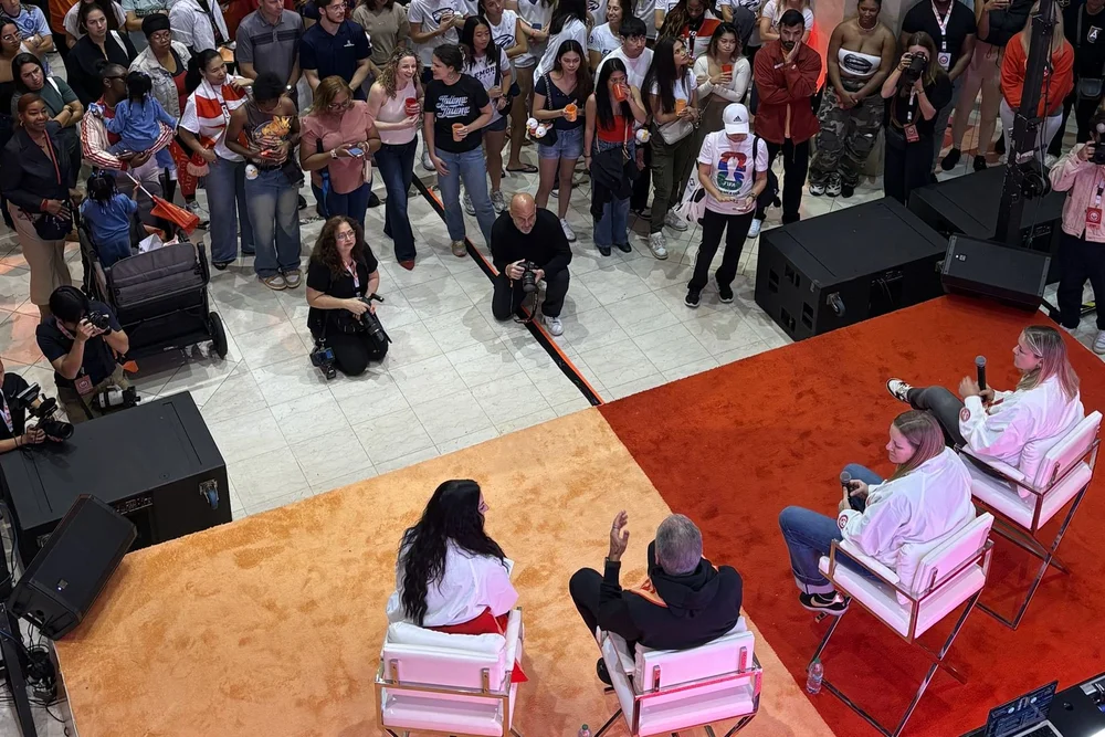
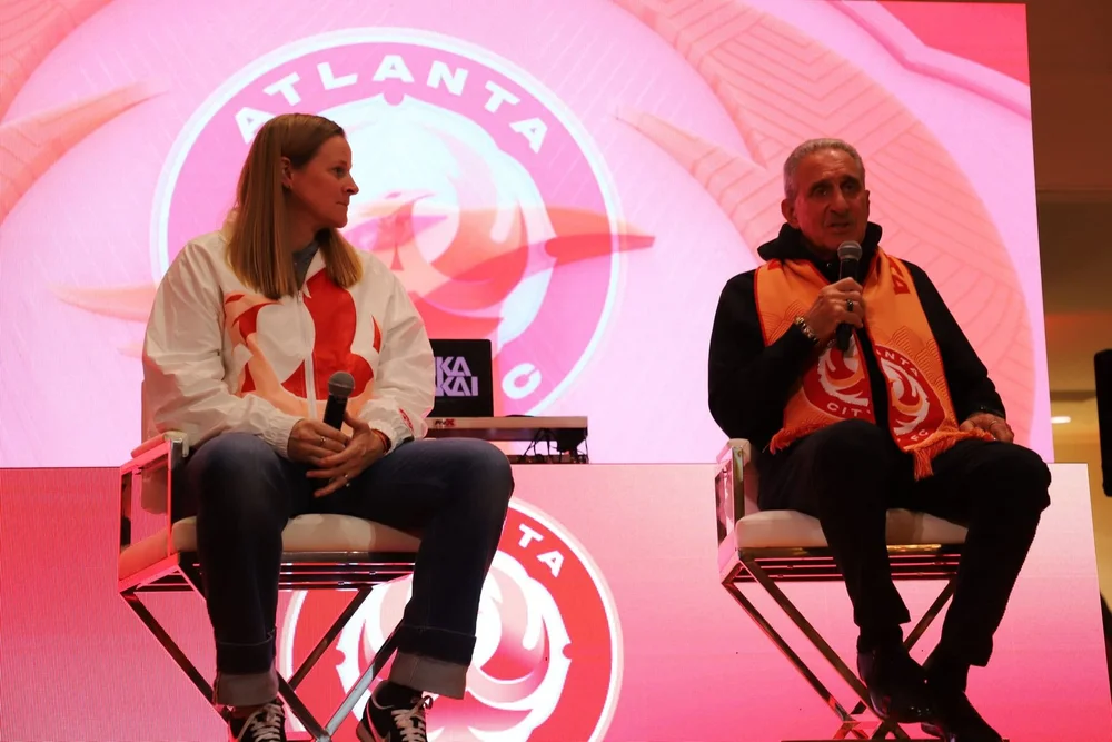
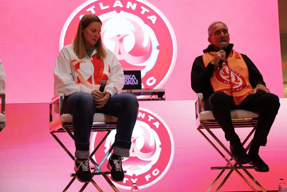
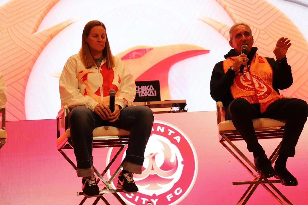
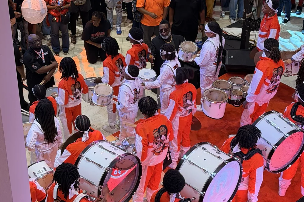
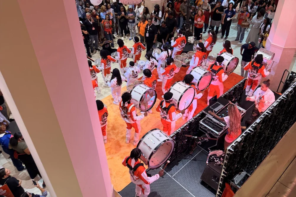
The Brand Comes to Life at the Official Launch Party
PROJECT: PASHA HEALTH BRAND IDENTITY


Collateral

Linear Logo

Tagline
CHALLENGE:
Create a brand identity for a start up in-home health care company, including brand statements, logo, tagline, website, and a go to market strategy.
SOLUTION:
The concept for the brand is focused around the founder and her relationship with her Ukrainian Grandmother who inspired her to serve others. We used Grandma’s nickname for the brand name and the logo was derived from the Ukrainian Motanka Doll representing caring and warmth through a motherly angelic figure.
PROJECT: ANTA - KEVIN GARNETT BRAND IDENTITY


CHALLENGE:
Create a logo for Kevin Garnett that will become the symbol of his brand, signature shoe, and product line with Anta. The logo needed to represent Kevin on and off the court.
SOLUTION:
Kevin’s personality blends intensity with a love for simplicity. On court, his fierce focus is unmistakable; off court, he’s drawn to clean lines and fashion-forward minimalism. His primary logo reflects this, a strong, timeless monogram rooted in simplicity. To capture his trademark intensity, we also created a secondary mark inspired by the powerful look in his eyes.


